Message Elements
When building a bot, it’s important to recognize that some UI Elements are better for displaying specific types of information than others. The following highlights all the different UI elements available and their best practices.
Text
Uses
- Use text to convey messages to your audience.
Tips
- Text blocks can contain a maximum of 640 characters.
- You can string multiple text blocks together.
- Any buttons you add to your text block will be added to the last text block.
- Text blocks support a maximum of 3 buttons.
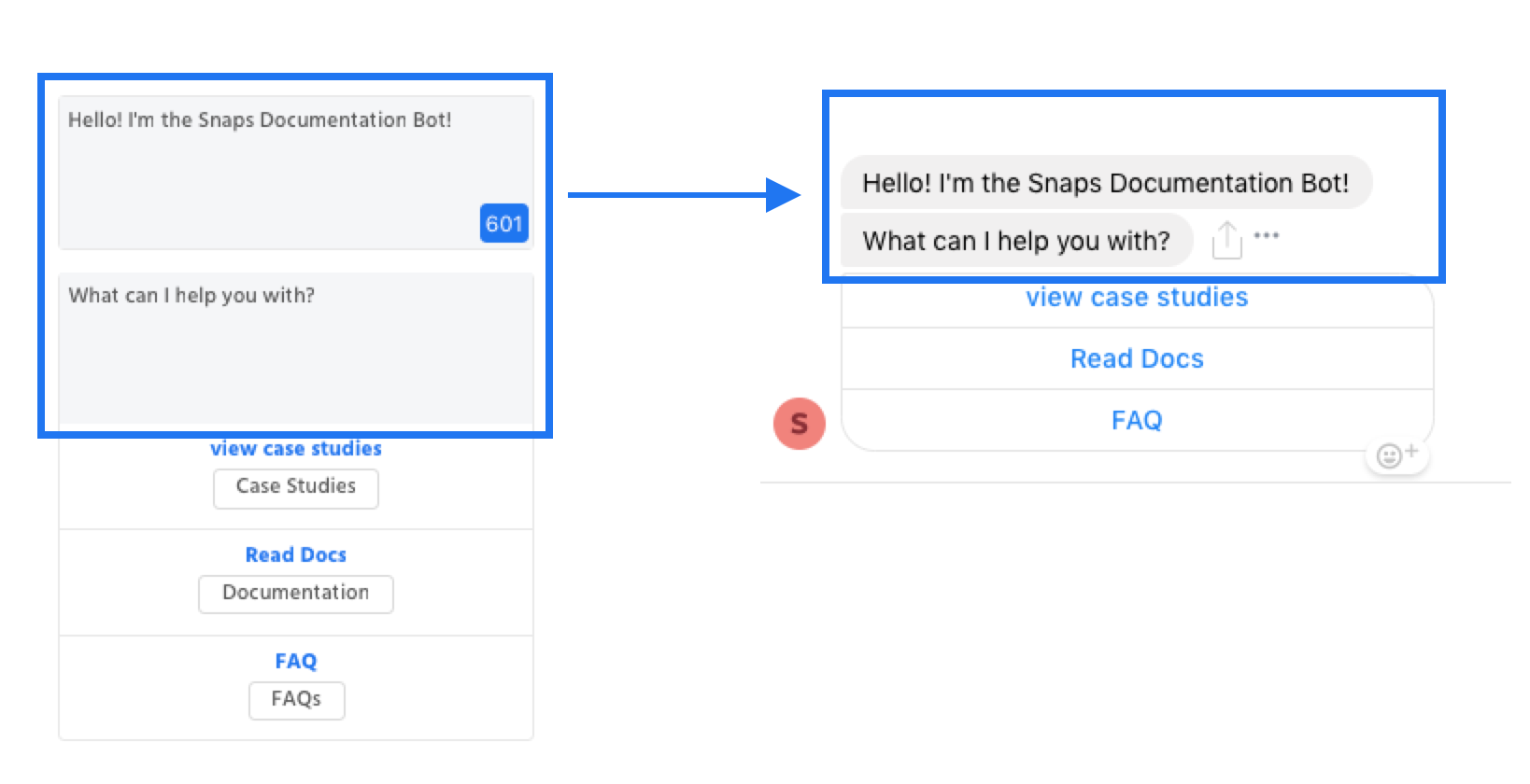
Buttons
Uses
- Use buttons to prompt the user for follow-up or further interaction with a particular message.
- Use URL buttons for tasks that you want completed on your website (ex: purchases, account linking, etc.). Make it clear you’re sending users outside of the experience.
Tips
- Start with a verb to help users understand the action they’re taking.
- Send a response after someone taps a button. This confirms that you’ve processed or completed their action (ex: canceling a reservation, answering a question).
- Don’t use buttons when their action depends on the current state of the bot, since they’ll be permanently available in the thread.
- Don’t use more than 1-3 words or add punctuation. Try to keep your text under 20 characters, including spaces.
Specs
- Character limit of 20 characters.
- Up to 3 buttons are allowed in one message block.
Button Modal
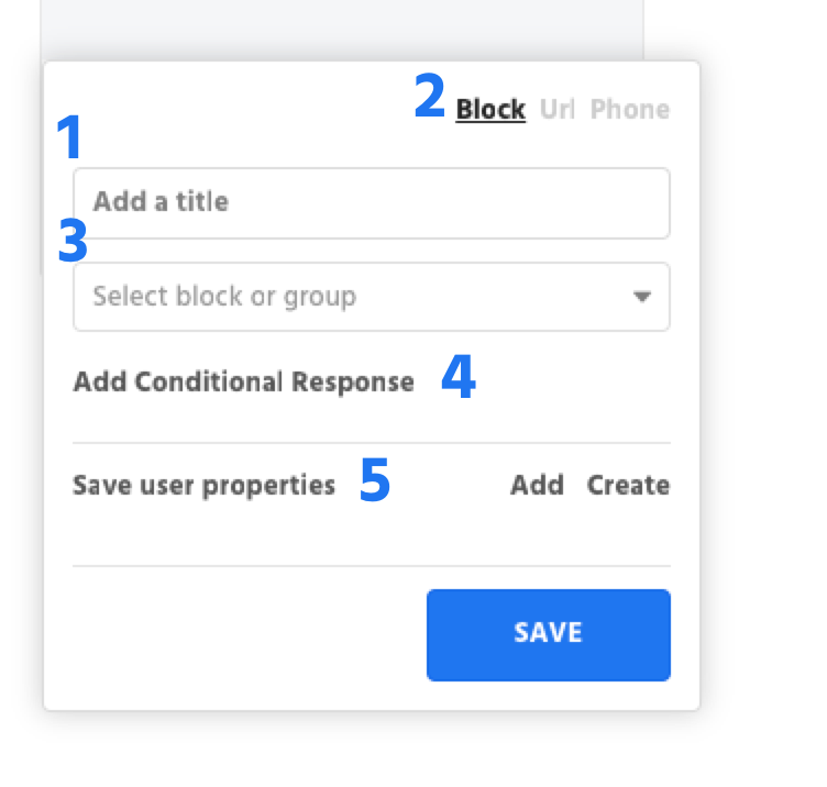
1. Button Title - This is the name of your button that users will see.
2. Button Type - This is the type of response your button will send when clicked:
- Block - the button will send the users to a different block
- Url - the button will send users to a website
- Phone - the button will call the number entered in
3. Set Response - This is where you enter the Block, Url, or Phone number that users will go to when they click the button.
4. Add Conditional Response - Buttons can make use of Conditional Responses for more complex experiences.
5. Save User Properties- Set User Properties when a user clicks on your button.
Buttons
Buttons are slightly different in that they can be added to a variety of message elements. You'll see the option to add a button below message elements that support buttons (text, carousel cards, & list templates)
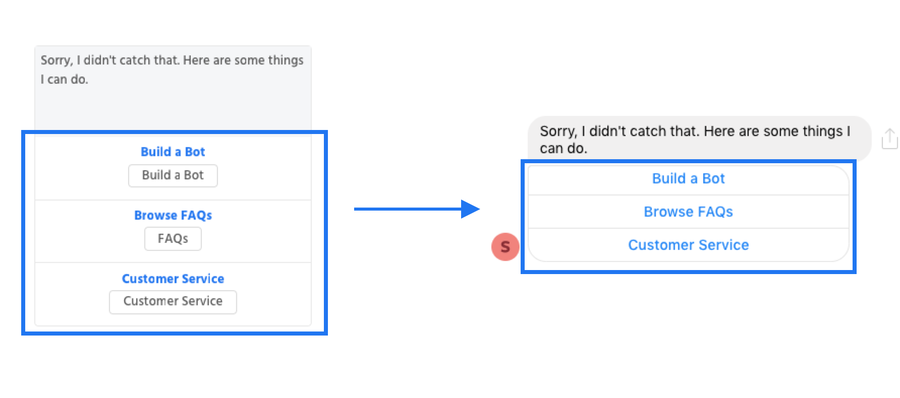
Image / Video
Uses
- Use images / videos to enhance your experience.
Tips
- Video plays cannot be tracked - we cannot know how many users play or finish the video.
Size Limits
Max attachment size is 25MB for videos, gifs and images.
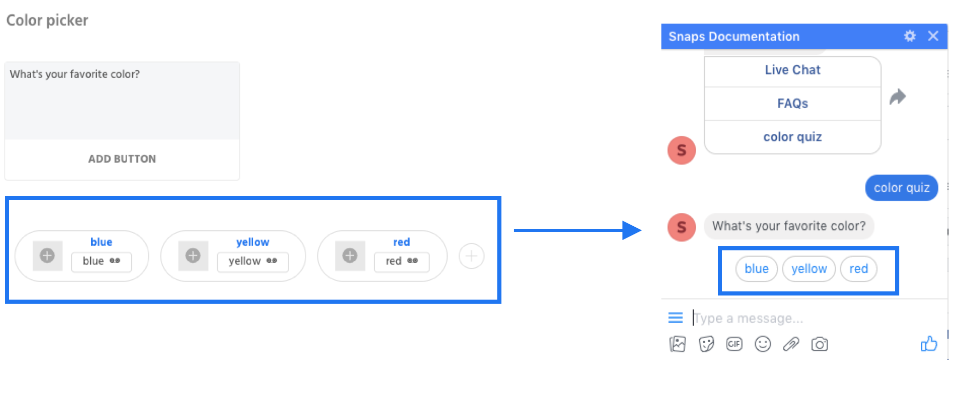
Quick Replies
Uses
- Allows you to send images, GIFs, and video. Animated GIFs play automatically while users must click 'Play' for videos.
Tips
- Be brief — long quick replies will be truncated.
- Don’t use for actions you’d like to be permanently available: quick replies disappear after the next message.
Specs
- Character limit of 20 characters.
- Maximum of 11 quick replies are supported at a time.
- An optional image on the left side of the button. Image should be a minimum of 24px x 24px. Larger images will be automatically cropped and resized.
- Facebook Only Capabilities: Request a person’s location, email address, and phone number.
Carousel Cards
Uses
- Use a carousel when there’s a priority order to your content, i.e., the first item is probably the most interesting.
Tips
- Strive for consistency. If one card has a photo, include a photo in all of them.
- Minimize the number of generic templates in your carousel. Too many makes it hard for users to remember all the options.
- Don’t use a carousel when it’s important that users see everything in the list. They may not scroll to the end. Consider a List Template instead.
- Don’t include a button on each carousel that takes the user to the same place regardless of which carousel card they select it on. It is a wasted CTA and should be listed in either a Quick Reply below or omitted.
Specs
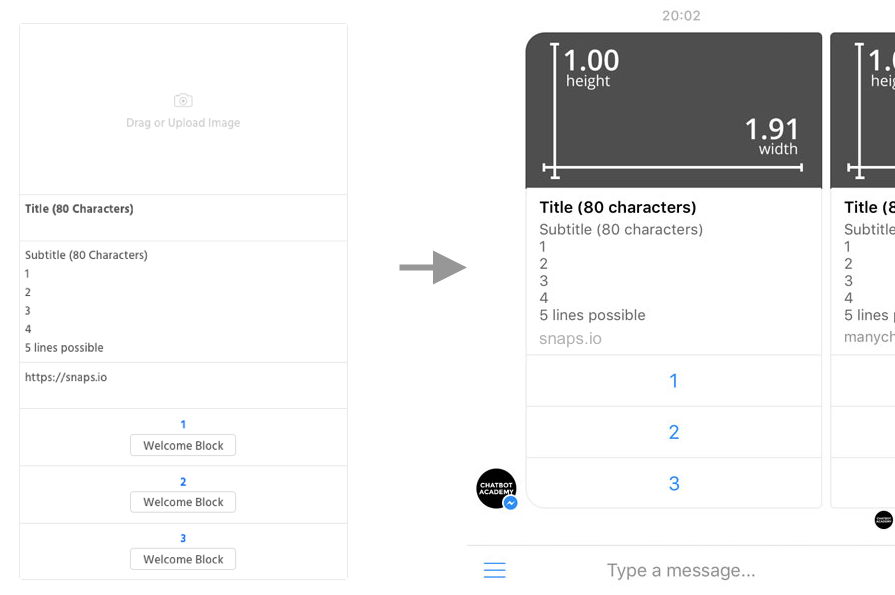
- Up to 10 items are available per carousel.
- Item title character limit: 80 character
- Item subtitle character limit: 80 character
- Card url: adding a url in this field will make the entire card clickable and will send users to the link set in the card url
- Image aspect ratio: 1 : 1.91 (Recommended dimensions: 520px height, 1000px width)
- Maximum of 3 button is supported at the bottom of each carousel item with a character limit of 20 characters.
List Template
List Template Messenger Support
The list template is no longer supported in Facebook Messenger, it will be converted to a carousel card if used. The list template is still supported in the web chat.
Uses
- Display a limited amount of content in a menu-like format.
Tips
- Be concise with your list and its content, since it scrolls in the same direction as the thread unlike a carousel.
- Provide a list-level action if there’s a chance none of the items will meet your user’s needs.
- Don’t use this if you don’t need or want your user to see the list — if, for instance, it’s ranked and likely that the first item will do the trick. Consider a Carousel instead.
Specs
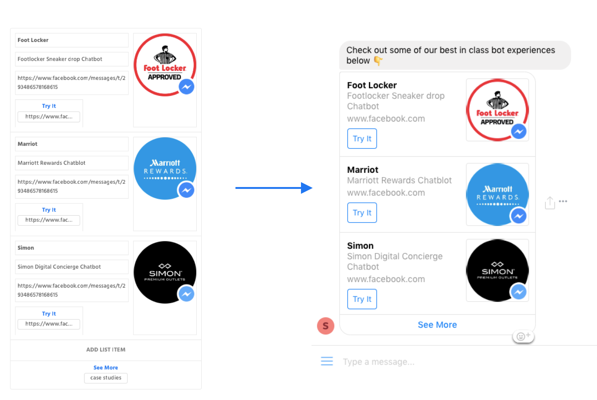
- 2-4 items per list
- Item title character limit: 80 character
- Item subtitle character limit: 80 character
- Card url: adding a url in this field will make the entire card clickable and will send users to the link set in the card url
- Top cover image aspect ratio: 1 : 1.91 (Recommended dimensions: 520px height, 1000px width)
- Right hand list item image aspect ratio: 1 : 1 (Recommended dimensions: 400px height, 400px width)
- Maximum of 1 button is supported at the bottom of the list with a character limit of 20 characters.
Time Delay
Uses
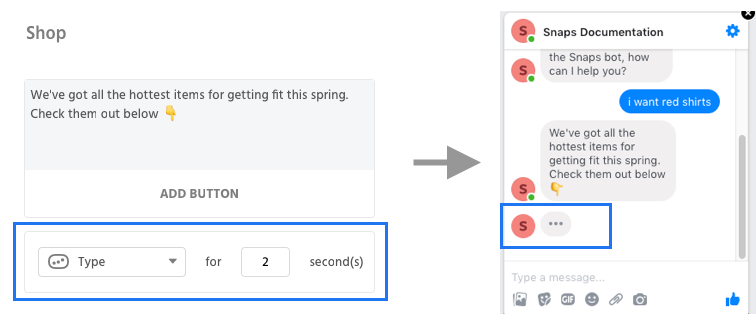
- Allow the bot to wait a certain amount of time before sending its response.
- Choose between showing a typing indicator or no indicator at all.
Tips
- A time delay may be useful in a situation where you are showing a user results - for example, quiz results or product search results so that the conversation flow seems more natural.
Specs
- Only supported after text, image/video, elements.
Save User Input
Uses
- Save a user's free text input as a user property and ignore all intents for that block.
Tips
- This is useful in cases where you may want to ask a user a question and do not want any intents to be triggered.
- For example - you might have a block that asks for a pet's name. The user's pet could be named 'Hello' and without 'Save User Input', it would trigger the 'Greeting' intent instead.
Specs
- Intents will not be triggered on this block.
- Invalid / Valid blocks must be selected if a validation is chosen.
- Validation exists for phone numbers, email addresses, date, numbers, addresses.
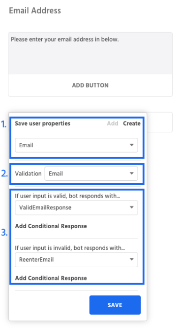
1. Save User Property - The user's free text response will be saved as the value of whatever user properties is selected.
2. Validation - By default, all input by the user will be considered valid. If the user input requires validation (ie phone number, email, zip code, etc) you can add in validation that will check to make sure the text the user enters matches the expected format and value.
3. Bot Response - The block that bot responds with after the user has entered their free text. You will need to select blocks for both invalid and valid responses if you use validation.
Go to block
Go to blocks allow you to send users a brief message before sending them to a new block.
Updated about 1 year ago
